Summary
Modern SaaS sites are chasing aesthetics over action. Designers love glassmorphism, scroll hijacking, and oversized gradients — but actual users? They want clarity, speed, and a reason to click. This article explores why simpler, content-focused landing pages consistently outperform flashy ones, backed by conversion data, user behavior insights, and our own approach to designing the Hexa template.
The Illusion of “High-Design” Conversion
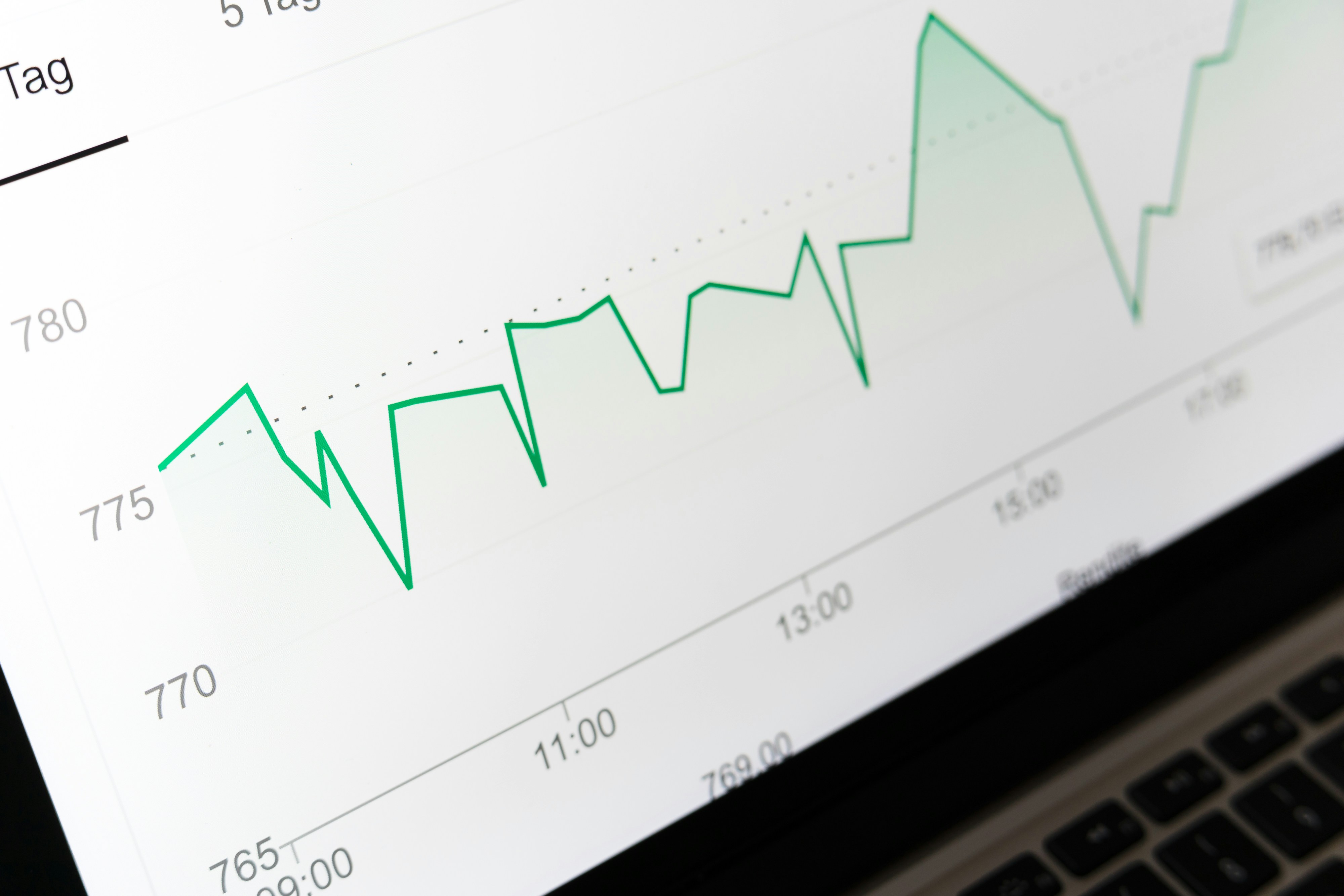
If you're building a site to win awards, then yes — make it cinematic, interactive, dazzling. But if you're trying to get signups, demos, or sales, the data tells a different story:
A one-second delay in load time can drop conversions by up to 7%
Mobile bounce rates increase 32% when load time goes from 1s to 3s, and up to 90% at 5s
Sites that load in 1s have a 40% higher conversion rate than those that load in 3s
That flashy animation? It’s probably costing you leads.
Clarity Wins — Always
Too many landing pages are designed to impress, not convert. We’ve all seen them:
Scroll takes over your mouse
Text floats over a blurred video
You finally find the CTA… in size 14pt gray
These may look gorgeous in a Figma mockup — but they confuse the real user. And confused users don’t convert.
In contrast, clarity-centered design keeps things simple:
Hierarchy is visual, not interactive
Every scroll has purpose
The value prop is clear within 3 seconds
Ask yourself: Is this page designed for someone skimming on mobile with 4G in a Lyft? If not, rethink it.
Real Data, Real Decisions
We designed the Hexa template around speed, focus, and flow — not fluff. Here’s what it delivers:
Design Choice | Why It Converts |
|---|---|
Minimal DOM & animation | Improves load speed and LCP, especially on mobile |
Consistent font and color styles | Increases visual trust and scannability |
No scroll hijacking or parallax | Lets users stay in control (and scroll predictably) |
Modular sections (hero > problem > features > CTA) | Supports decision flow, reduces bounce |
Clear, repeated CTAs | Keeps the user moving toward one outcome — not 10 |
Fancy pages show off. Simple pages sell.
What Your Users Actually Want
SaaS buyers — especially on their first touch — aren’t looking to be blown away. They’re looking to answer 3 questions:
What does this product do?
Is it relevant to me?
Can I trust this enough to click next?
If your landing page answers those in under 10 seconds, you've already won. If it's still fading in logos by second 11… you've already lost.
Final Thought
The highest-converting pages aren’t always the prettiest. They’re the clearest. They load fast. They guide users with intention. And they remove distractions in the name of momentum.
Want a template that’s optimized for clarity, speed, and conversion?
👉 Launch with Hexa Template